Pits For Tits Poster
This poster was created entirely in Illustrator for a class assignment. The assignment was to select a non-profit organization and create a poster with a specific goal in mind. For fonts, I used Allstar Regular and Kristen ITC, which most closely mimicked both brands' fonts.
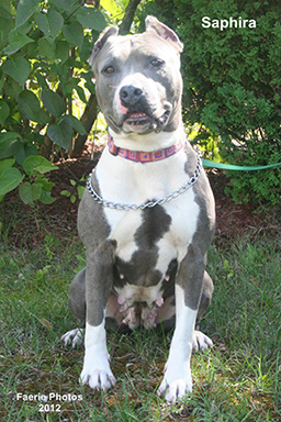
Saphira was one of the residents at the Manchester Animal Shelter. I volunteered with her every Sunday. She has a beautiful face that was neither too dainty nor too blocky so I decided to use her as inspiration for my digital sketch.

The first draft came off as too severe. the eyebrow shape made the dog look as if it was scowling. Due to the breed's negative image, I felt it was crucial to make the dog look as friendly as possible.

The corners were softened and the eyebrows raised. Now the dog looks less threatening and almost sleepy or humorous.

Initially, the stroke was going to be white but I opted to use the same gradient that was used for the breast cancer awareness ribbon.

The final dog. With softer lines and a more subdued color, the image is still striking, but not overpowering.

The final poster